When the architect began discussing design ideas, he realized there were many "problems" with the existing building site. It was already problematic, and it was even worse compared to the homeowner's needs.
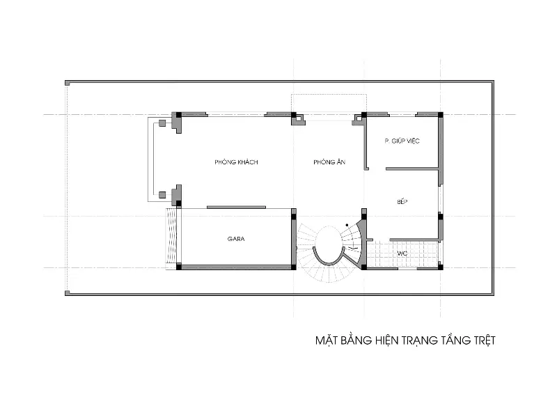
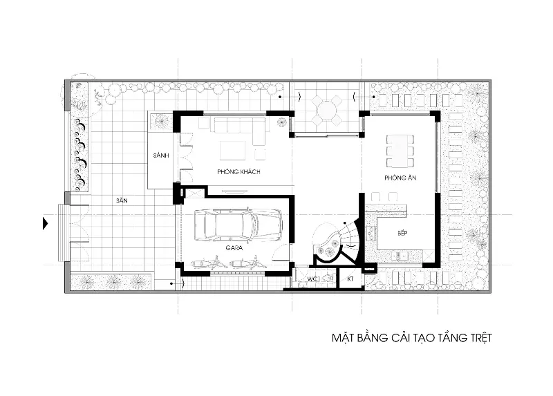
The ground floor garage is too small, only big enough for one car. The kitchen area is blocked off by the bathroom and maid's room, making it difficult to connect with the dining area outside near the living room.
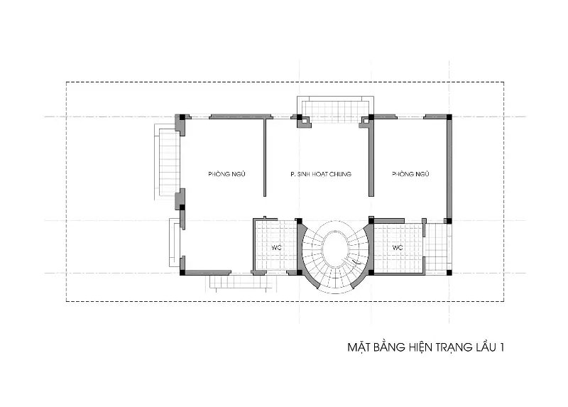
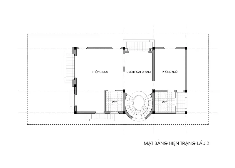
Furthermore, given the current layout of this area, it is difficult to arrange the kitchen in a way that aligns with the homeowner's birth year. The floor plan is fragmented and does not take advantage of the views of the surrounding garden. On the first and second floors, the functional rooms have illogical sizes and shapes, making interior design difficult…
Setting aside issues of design and style, the architect began working on the floor plan. Many solutions were proposed, along with careful consideration of the pros and cons. Ultimately, this was completed, with the most important aspect being the ground floor plan.
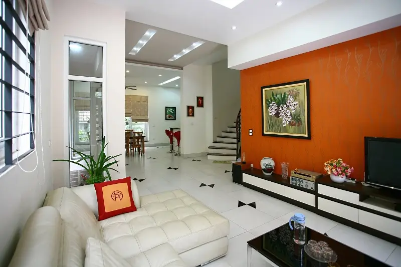
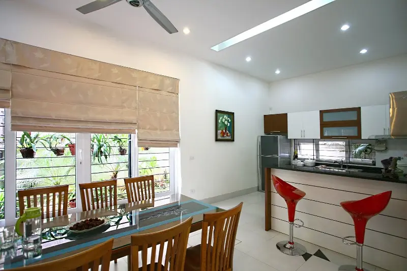
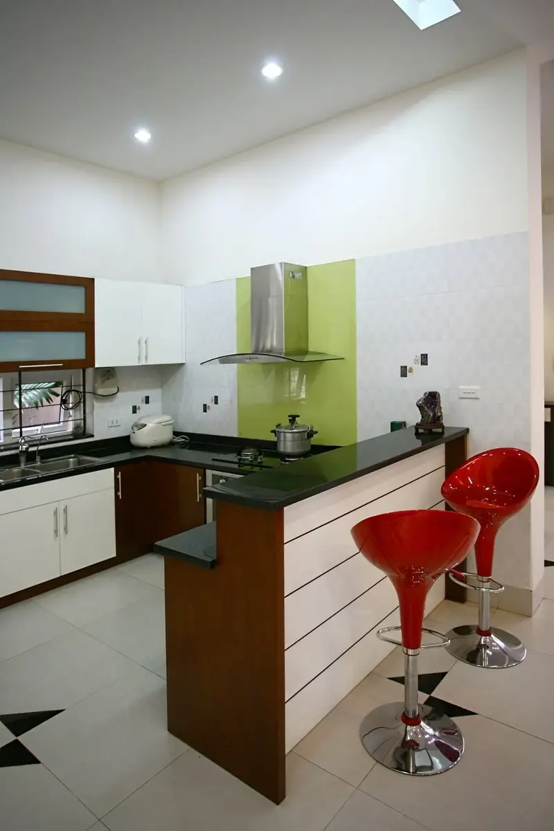
Accordingly, all the partition walls at the back were removed to create a kitchen and dining area connected, with the dining table positioned to face two large windows overlooking the garden. The kitchen and dining area have a coherent and clear structure, and most importantly, this solves the problem of the kitchen's orientation being auspicious according to the homeowner's birth year.
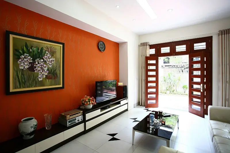
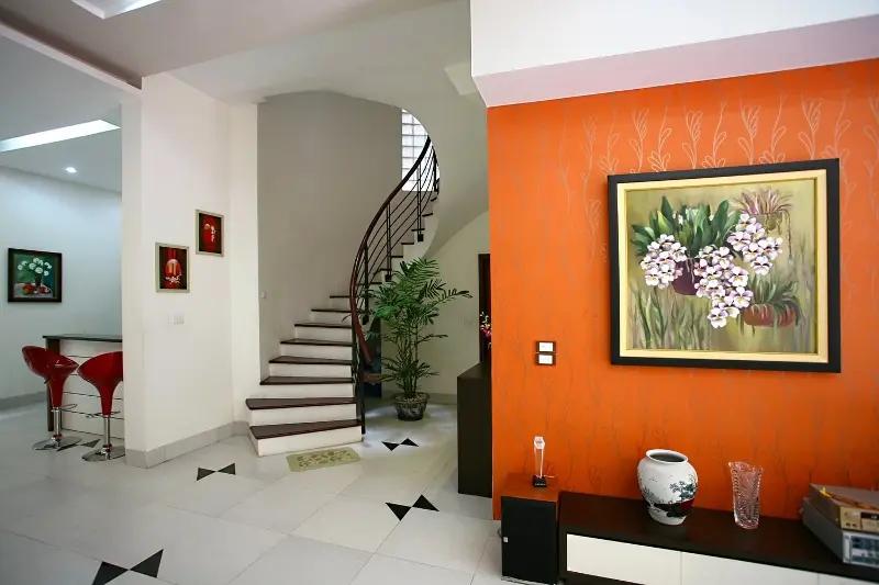
The garage was extended on both sides, providing ample space for cars, motorcycles, and of course, a walkway. The wall separating the garage from the living room jutted out into the living room to avoid the TV stand being too long, also creating a focal point; at the same time, a recessed area on the garage side was created for a storage cabinet.
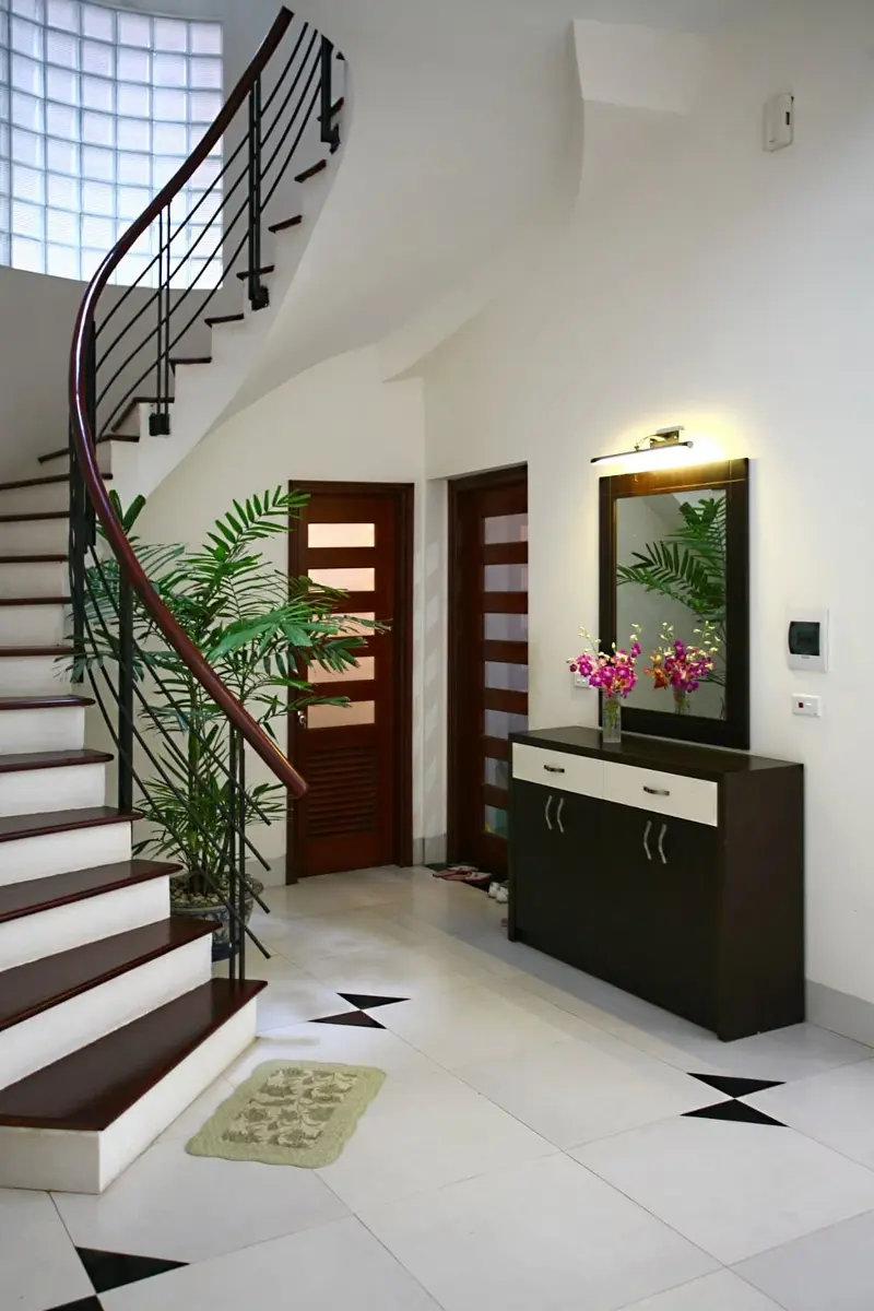
The garage door is cleverly concealed under the stairs instead of opening directly into the living room as it currently does. In the area between the living room and dining room, the straight wall is… pushed back into a U-shape, creating a charming little patio in the garden.
This is also a way to create a symbolic separation and boundary between the living room and dining room. This central area connects the functional spaces of the entire ground floor and also serves as a play area for children. Finally, there's… the bathroom.
The architect boldly proposed moving the bathroom completely outside the house, under the staircase – discreet and convenient. After careful consideration, the homeowner agreed, accepting the only "sacrifice" on this floor: the inability to follow the continuous garden around the house.
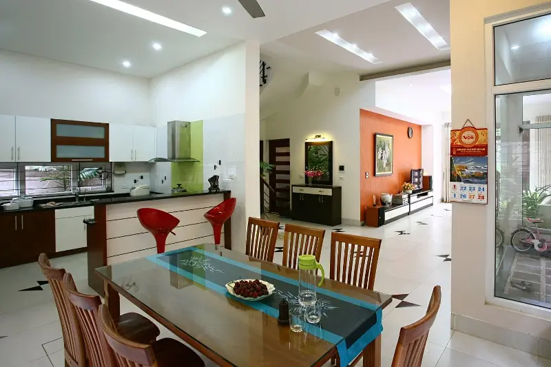
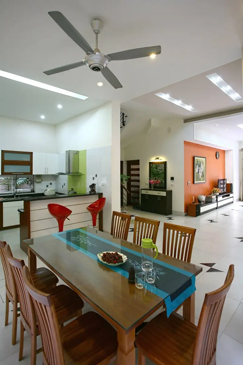
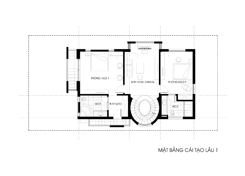
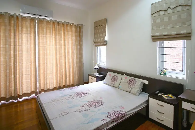
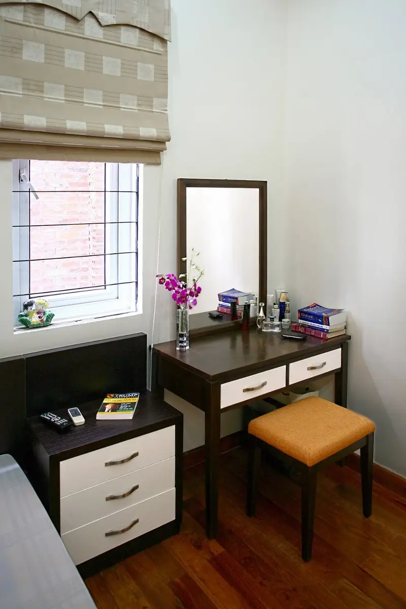
The first floor was redesigned with the master bedroom on the outside, complete with an en-suite bathroom and dressing area. The spacious landing serves as a common living area, extending directly towards the staircase without any partitions.
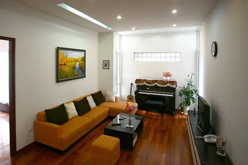
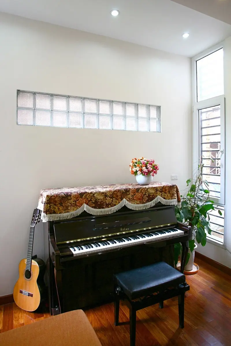
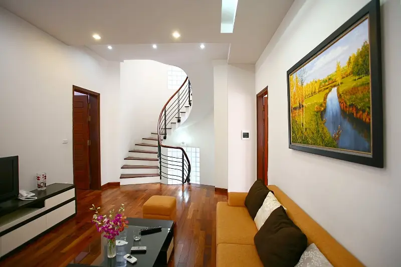
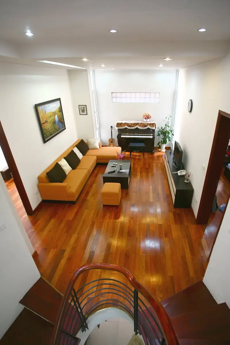
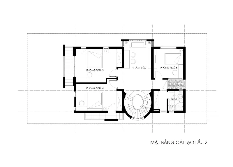
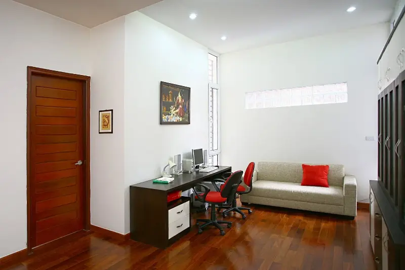
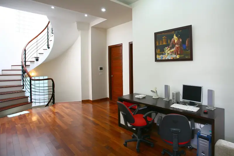
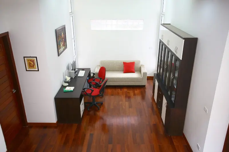
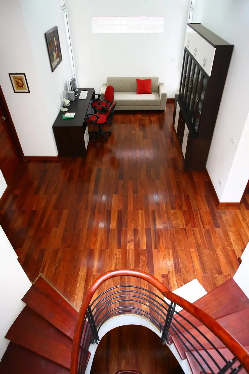
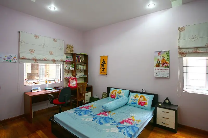
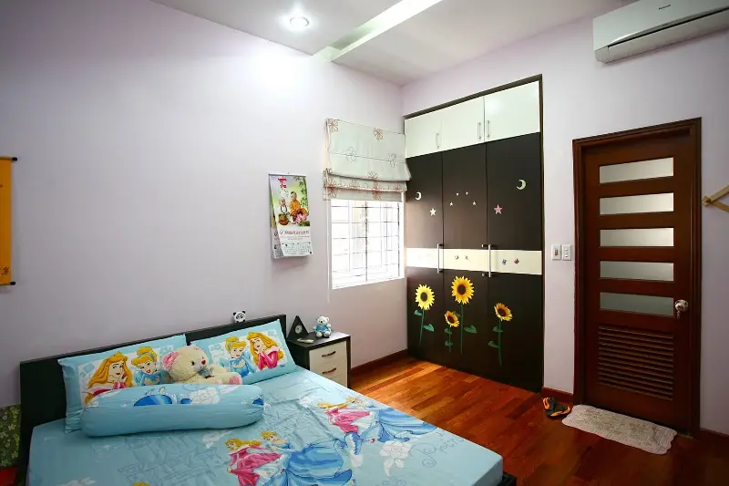
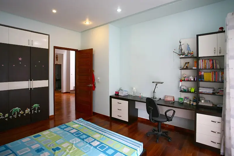
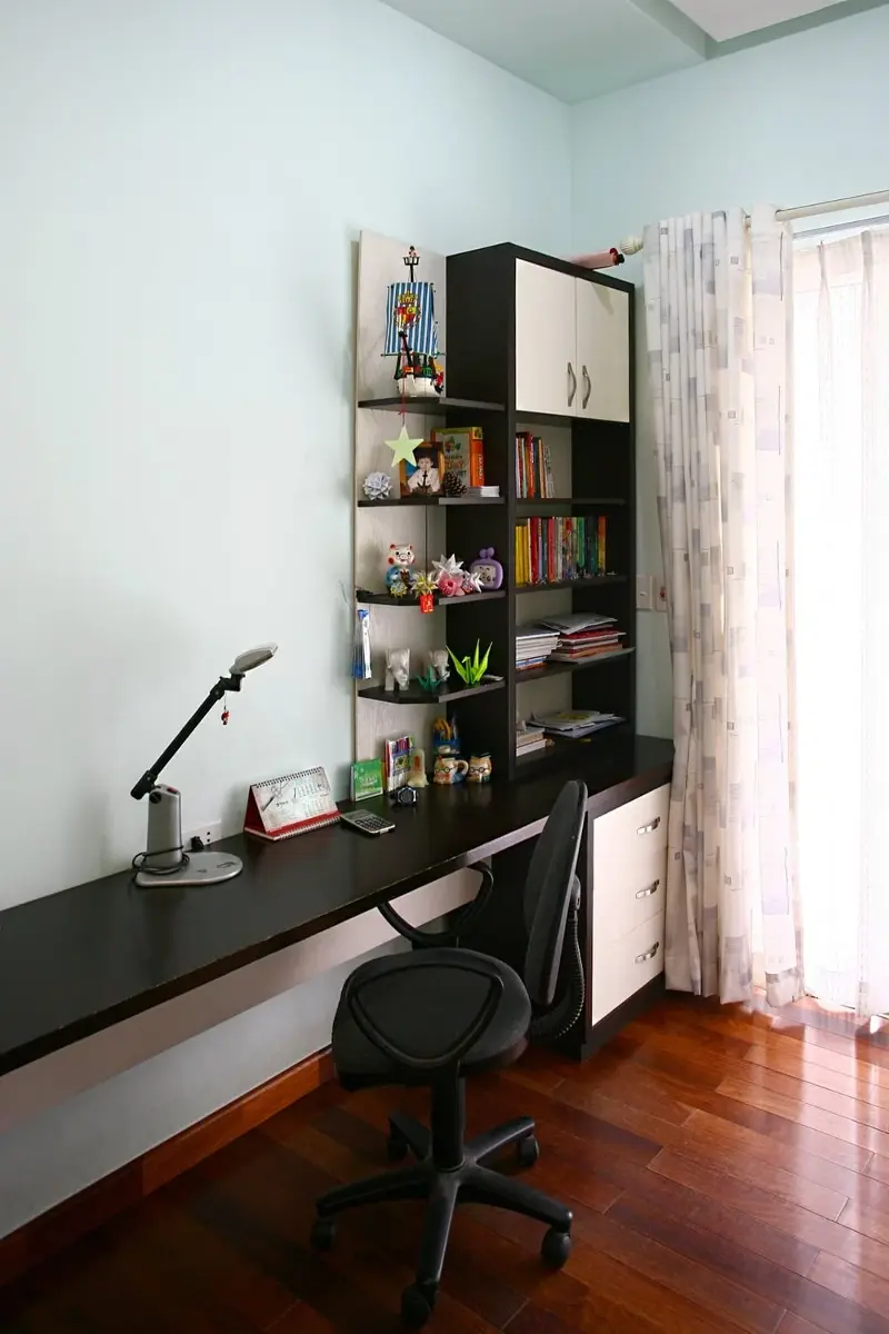
The second floor has been redesigned to have three bedrooms instead of the original two, with the landing area serving as a workspace for working on a computer and reading.
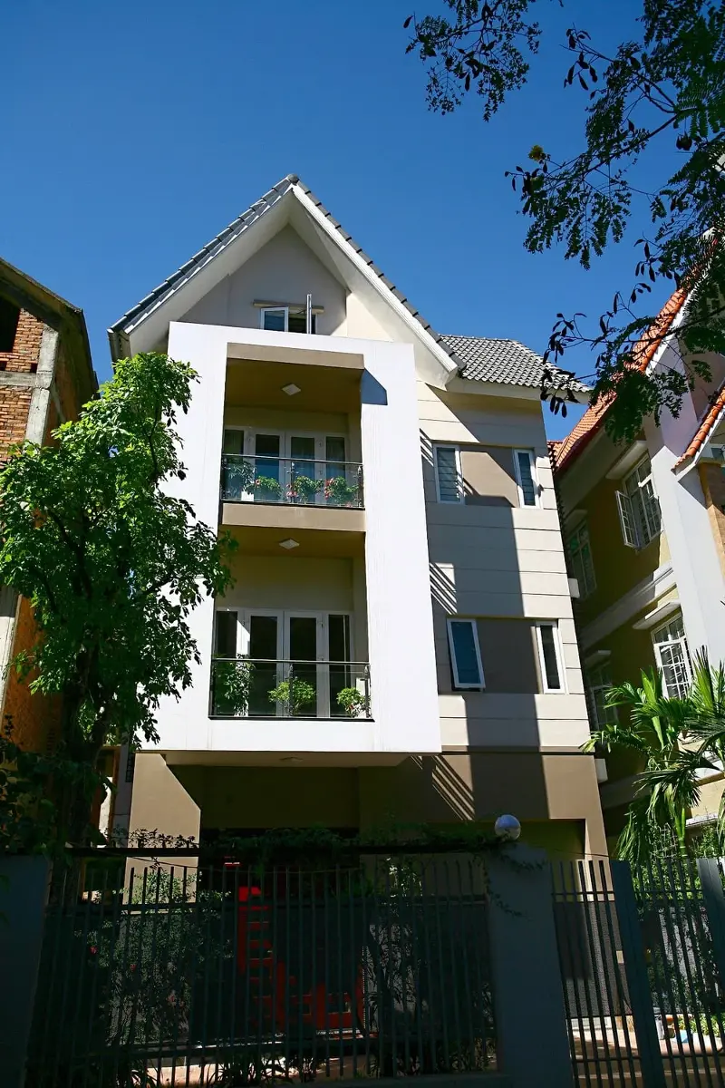
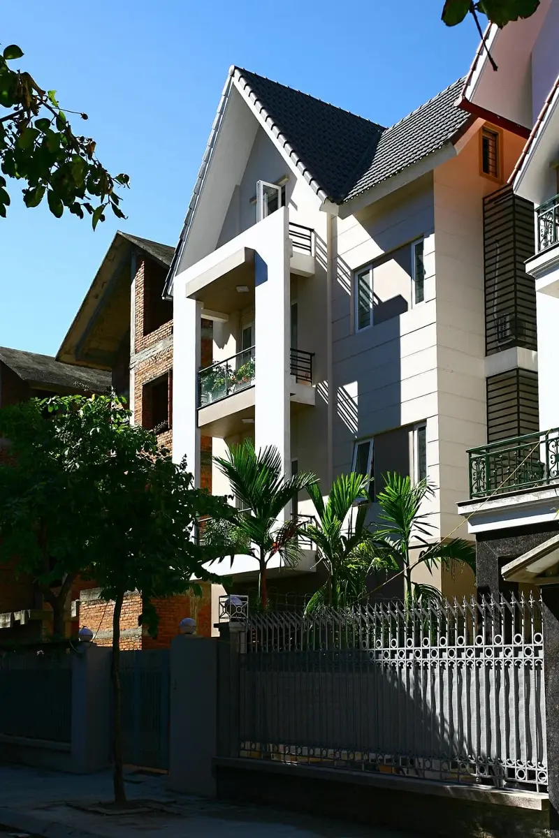
Returning to the original issue… The villa's "form" was built in a "classical French " style with many balconies, tiered cornices, window sills, and a sloping roof. The homeowner disliked it completely, but also didn't want to make too many changes or demolish too many structures, including the roof system, due to cost constraints.
The overall design direction remains simple, youthful, and modern. Given the existing layout, the two large balconies on the first and second floors were transformed into loggias, with a slanted wall effectively blocking the east-facing sunlight from entering the bedrooms; the two smaller balconies were demolished.
The two balconies on the left side were transformed into technical loggias for ventilation and air conditioning installation. The two balconies on the right side were connected to the rooms by walls. The use of white plastic doors and glass-steel railings contributes to the light and airy feel of the building's facade.
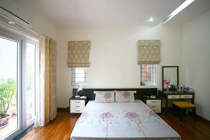
The interior design also reflects this spirit: not overly ornate or cluttered with details; not strikingly impressive in an unconventional way, nor minimalist with nothing at all. Everything is just right, simple, unified, and… light and airy.
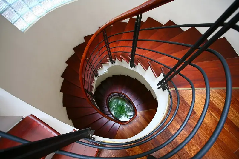
Natural light is maximized through a system of windows and glass bricks – carefully calculated to suit the placement of furniture in the room. The scientific approach to interior design and functionality is prioritized over creating a visually appealing impression.