“I would rather have a smaller house exactly how I want it, than a larger house that isn’t properly finished,” says Holly Lamont, an interior designer. “The social assumption is that bigger is better, but I believe a small house executed with skill and purpose, in which everything is carefully designed and well built, is more meaningful and practical than a large house that is poorly constructed or lacking in attention to detail.”
It’s a quietly radical idea, which Lamont has put into practice in her own Victorian home in Cheshire. This colourful, layered space, which speaks precisely to her needs and is full of joie de vivre, is enough to persuade any doubters that small(er) can most definitely be beautiful.
Like many people, Lamont and her now husband, Tommy, re-evaluated their lives during the Covid lockdowns and decided it was time to leave London.
They hankered after a new life in the countryside but worried that the contrast with city life might be too great. They settled on the picturesque village of Tarporley, near where Lamont grew up, and initially rented until they found the right home to buy. Two years later, Lamont was browsing Rightmove and spotted a pretty, classic Victorian semi, backing on to a small woodland and fields. A few months later, they had the keys.
Lightening the mood
Although the house was in good condition, it felt dark and oppressive. “Partly, it’s the orientation of the building, but the heavy and mainly grey decoration made it feel like the walls were closing in, despite the lovely high ceilings,” says Lamont.
Financially, an extension was not an option, so in line with her less-is-more outlook, Lamont set about making it feel light and bright through clever decoration.
In the main living areas, she has set the tone with walls in Jonquil, a pinky neutral, by Edward Bulmer. “It’s a common mistake to think that only whites, creams, and greys can be neutral,” she notes. This plaster colour provides a warm backdrop for furnishings and textiles in interesting shades and textures.
To this, she has added artworks and objects, which she likes to change and update on a regular basis. “I enjoy swapping things out. I want the rooms to feel curated, but not overly done,” she says.
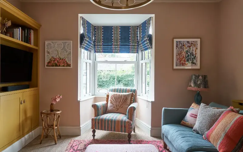
The sitting room
Originally, the house had two separate reception rooms, but Lamont decided they would work better as one room divided by a partition wall. “The second reception room was already joined to the kitchen, but we wanted to make it a single big space,” she says. “We have always lived like that, and, as the chef, Tommy didn’t want to feel isolated when he was cooking.”
The dining area has wood floorboards, whereas the living room is carpeted in Woodstock from Unnatural Flooring, which helps to create zones. “I wanted each part of the house to have its own identity,” explains Lamont. A pair of armchairs from Anthropologie, set on either side of the opening, further delineate the two spaces, and also make the sitting area feel cosy.
Built-in cupboards are a practical addition that provide plenty of storage and keep the room clutter-free. Lamont has painted them in India Yellow by Farrow & Ball, a punchy colour that gives the room impact and an instant lift.
The bay window, which was once dressed with florid curtains, now has simple Roman blinds in a fresh stripe, which let in more natural light and make the room feel bright and airy.
The dining room
While the couple reused key pieces of furniture from their previous home, including a bed and a sofa, there was still plenty they needed to buy.
One of their most significant purchases was the oak dining table from Another Country, and Wishbone-style chairs from Where Saints Go. Lamont has dressed them with playful, mismatched cushions from Mind The Gap, which pick up the teal, pink and ochre tones in the sitting area and kitchen. “After living in flats where space was limited, I was so excited to have a big dining table to host friends and family,” she enthuses.
She describes the mid-century sideboard from Four Quarters Home, which fits perfectly into the room, as the missing part of the puzzle: “I like to mix new and vintage pieces, and Four Quarters Home is a great source.”
The blinds are made from the same material as those in the sitting room and speak to the blue of the kitchen units – a clever way to create continuity and flow between the three spaces.
The kitchen
Previously, the kitchen was a white, clinical space. There was no budget for a replacement, and it felt wrong to ditch the blue-grey quartz worktop, which they liked and was good quality. Instead, Lamont has fashioned the room into a welcoming, decorative space by repainting the cupboard doors in Wine Dark, a rich blue by Farrow & Ball, replacing the subway tiles with a pretty splashback in tiles from Ca’ Pietra, and adding a Roman blind in Loom Weave by Christopher Farr Cloth.
“I think it’s well worth investing in beautiful fabric or wallpaper,” she notes. “I’ve used Pierre Frey fabrics quite a lot in this house. But for accessories and lights, I’m also happy to use high street shops, such as Oliver Bonas or Anthropologie.”
The hallway
The dark, dingy hallway has been lightened with geometric floor tiles from Bert & May, walls painted in Lilac Pink by Edward Bulmer, and a jolly stair runner from Roger Oates – one of Lamont’s favourite pieces in the house.
A large mirror bounces light around and makes the space feel bigger, while a shelf provides a spot for decorative objects.
The main bedroom and dressing room
The scheme for the main bedroom, which was formerly dominated by swirly yellow wallpaper, is built around a blind in Cochiti from Pierre Frey, which was originally made for the flat but fitted this window perfectly. “Reuse is cost-effective and good for the planet. I’m all in favour of reupholstery too; buying new is so wasteful,” says Lamont.
She also half-blocked the alcoves to create shelves and a flat wall for the bed and bedside tables – which the previous owners had positioned in front of the window – freeing up space for a window seat.
Although she would have liked to replace the fitted furniture in the dressing room, it was too costly, so Lamont repainted the existing cupboards, dressing table and mirror frame, in Selvedge by Farrow & Ball, added an Amarillo carpet from Unnatural Flooring, and papered the walls in Tilly wallpaper from from GP & J Baker, which she also used on the shelves in the main bedroom.
The woodwork in both rooms has been painted in Selvedge – a neat, inexpensive way to link the two areas, which also feels fun and gives the rooms a smart, tailored look.
The spare room
“This was the trickiest room to design. I toyed with wallpaper, but in the end decided to pare things back,” explains Lamont. Instead, she settled on colours that appear elsewhere in the house, including Jonquil and Selvedge.
Furniture is also kept to a minimum: “I knew if I put in a wardrobe I’d just fill it with my own clothes,” she says.
A simple brass rail from House of Brass and a dressing table from Anthropologie add character and are sufficient storage for guests, while decorative touches, including prints from King & McGaw and table lamps from Pooky, add personality.
Like every room in this characterful house, it’s a testament to the fact that colour, pattern and creative thinking can be enough to completely transform an interior.
Holly Lamont founded Holla Design in 2021