You can't escape the color green. It's the color of our natural world — it's in the forests, the fields, it sprouts in the summertime and rolls over meadows. But nor should you want to escape this boundless hue. In interior design, green evokes feelings of rootedness, serenity, life, and energy, depending on the shade you choose. While some staples have evolved over the years, green continues to regenerate in exciting forms in design, and 2026 has brought some exceptional shades.
Over the past few years, decorating with green has become much more nuanced. For a long time, "it was treated almost as a shortcut to calm; think soft sage walls, botanical references, quite gentle natural palettes," interior designer Tabitha Organ tells me. "Those tones still have their place, but I think the more interesting shift now is towards something less about a single, obvious shade and more about tonal variation, materiality, and how the color green interacts with light."
This has brought us chartreuse, acid greens, deep teals, and characterful olives, all of which connect to nature, just not in such a literal way. Today's color trends are about experimentation. And in many ways, "green has become less decorative and more atmospheric," says Tabitha. So if you're a little tired of leaning toward sage green or emerald, here are five shades of green currently shaping 2026's interiors.
1. Chartreuse
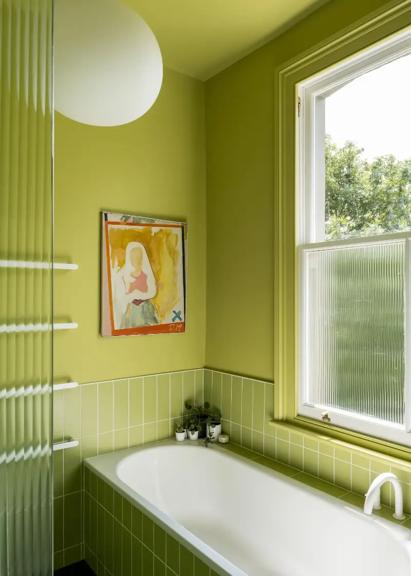
I remember having a chartreuse bubble skirt from J.Crew's children's line as a kid, and I was obsessed with it. This year, we have seen chartreuse make a full comeback on runways, and finally, the acidic yellow-green hue has made its way into interior design trends.
"Chartreuse has exploded into interiors this year for the zesty liveliness it brings to our homes," explains UK-based designer and color consultant Emily Brooks. The acidic yellow-green has completely infiltrated green tonal schemes in the best way, adding a much-needed pop while still feeling surprisingly natural.
"It's a case of go bold or go home, baby," Emily adds. "Bold, yellow-infused greens are scientifically proven to awaken our senses, promote creativity and playfulness, and encourage fresh perspective and renewal." So, believe it or not, chartreuse can even work as a sensory-conscious color in the right setting.
So, go on — embrace a high-gloss, citrine wardrobe in your bedroom, or drench your hallway in a soft lime. "Chartreuse is particularly lovely alongside reds, both bright and burgundy," adds Emily.
2. Lime Green
If you're drawn to the electricity of chartreuse but want a color that's more true-green, you'll be happy to hear that 2026 is reviving lime green. While the thought of 2016's design trends coming full circle may make you shudder, we do have that to thank for the return of lime and sour greens, though this time, we're approaching them with a little more sophistication.
Though Farrow & Ball's green paint colors are favorites for a reason, Emily says she's seen "one too many feature walls painted in Card Room Green or Green Smoke." Thankfully for her, she now says she's seeing clients choosing lime greens such as Boxington by Little Greene, or Linden by Fenwick and Tilbrook. And surprisingly, they're just as easy to decorate with.
"People decorated with forest and sage greens ten years ago to feel closer to nature, to bring the trees into the home," says Emily," but if you stand in a forest during the explosion of spring and look up at the leaves against the blue of the sky, you'll notice how bright and saturated they are in the sun. There is so much lime and acid green in the woods!"
Use it as a color drench or as a small pop, and it'll instantly make a statement in your home. Mix a high sheen finish with matte and plush textures to create visual interest, and always pair your bold greens with a complementary or contrasting color. "Lime works best in relation to other colors," adds Emily.
3. Sludgy Olives
"Olive is a color we continually return to," says Milan-based color expert Charlotte Cropper. "But this year it feels warmer and more complex." In the current world climate, there's a desire for spaces that feel comforting and cocooning, which these earthy mid-tones deliver beautifully. This year, they just have a bit more spice and style.
"What interests me is when a green has complexity, when it isn’t immediately restful but brings a certain energy or friction to a space," shares interior designer Tabitha Organ. That's what these sludgy, but bright olive greens are bringing to the table; it's a familiar shade with more punch.
"I think these shades are coming through because both nature-inspired and classic heritage greens have become so widely used that they can now feel quite expected," Tabitha continues. "These newer greens offer a way to bring freshness back into a scheme without it feeling decorative for the sake of it."
Decorating with olive green works everywhere. "Deep, muted olives and limes have been hugely popular in kitchens," shares Emily Brooks, "often paired with wood finishes, brown, or light, dusty terracotta."
4. Powdery, Apple Greens
In a similar vein to lime green, apple green is still popular in interiors right now, but perhaps in a softer, more powdery variation. "This year, we've seen a fresh update to the green trend with apples and softer limes fronting the trends," says Emily.
There is a growing appetite for color that feels more instinctive and less prescribed, so rather than popping a too-bright, acid green sporadically in a space, try playing with the hues, tints, tones, and shades. Sometimes a softer, paler variation can feel much more calming and cohesive in a space.
"Rather than replacing traditional greens entirely, powdery green tones tend to sit alongside them, adding contrast and subtle tension within a scheme," adds Tabitha. "I particularly like the unexpected combination of soft apple green and bright yellow," adds Emily. "It's cheeky and fills your home with hope and positivity."
5. Teal-Tinted Greens
Lastly, 2026 has really seen a comeback for decorating with teal, aquas, and deep blue-green hues. "This year, the greens that feel most relevant are those with a slightly complex quality, mineral-based greens such as mossy blue-greens and muddy teal tones," adds Tabitha. Something about a deep teal-toned green feels like a more nuanced, unique progression of shades such as emerald and forest green.
In terms of how to use them, it’s often about layering your design, say designers. "These teal-toned greens work particularly well alongside lighter, more desaturated shades like a chalky, mint-like green," notes Tabitha, as seen in the green kitchen she designed, pictured above.
Beyond that, deep greens always work well when it's embedded within materials such as timber, marble, textiles, and painted joinery, rather than applied too uniformly. "Allowing it to shift across surfaces and respond to natural light creates a space that feels more settled and less overtly designed," says Tabitha.Green is one of those colors that will continue to evolve, along with how we use it in our homes. But the important thing to remember is that decorating with color is always a personal pursuit.
As Tabitha says, "Green feels most successful when it isn't treated as a singular statement, but as part of a broader tonal composition. When handled this way, it becomes less about trend and more about how a space feels over time."