



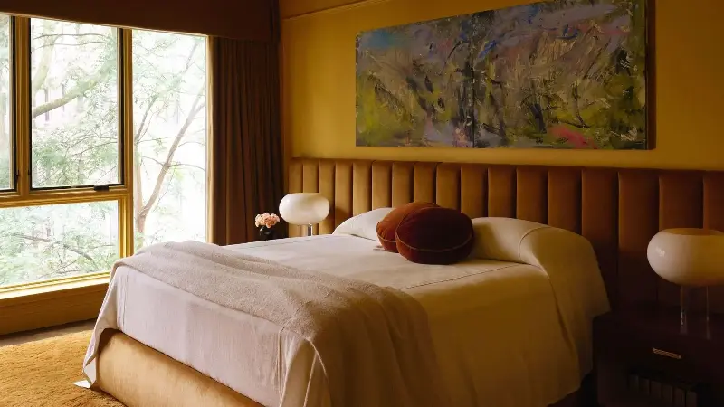
You don't need to look very far to see the widespread appeal of ochre right now — this moody shade of yellow is gaining momentum, and designers are fully on board.
Think of ochre as a new, sophisticated take on decorating with yellow: not at all bright or saturated, but earthy and rich, ochre is bringing endless warmth to rooms. But beyond the aesthetic appeal, designers and color experts are noting that it's the grounding, soul-filled mood it creates that makes it so meaningful right now.
Here, those experts share everything you need to know about the rich yellow hue; why it's trending, along with some of their favorite design ideas for decorating with it stylishly for the season ahead.
What Color Is Ochre?
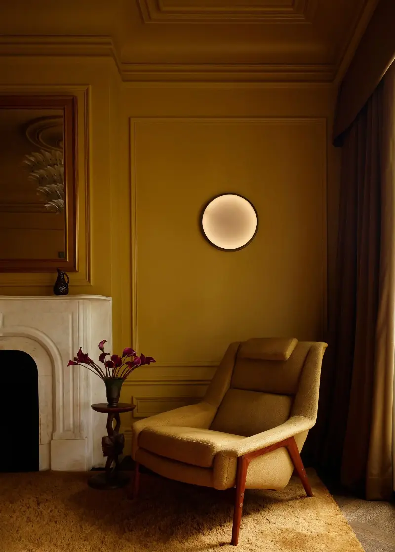
"Ochre lands somewhere between a field of sunflowers in full bloom and a pot of liquid gold, like a deeply enriched yellow that’s fallen into shadow," explains Livingetc's color expert Amy Moorea Wong. "Think fresh-from-the-hive honey. It’s warmer than a classic yellow, with a similar luminous quality plus added depth (its yellow base is generally tinted with brown, orange, or red) that makes it grounding and links it to the earth."
And while ochre is gaining appeal in the design world now, it is a color rooted in history and tradition. "Ochre is one of the oldest natural pigments we have and goes back hundreds of thousands of years," says Amy. "You’ll find it in prehistoric Kenya and Zambia, Aboriginal Australian ceremonies, ancient Egyptian tomb paintings, and Roman frescoes."
Why is Ochre Trending in Interiors?
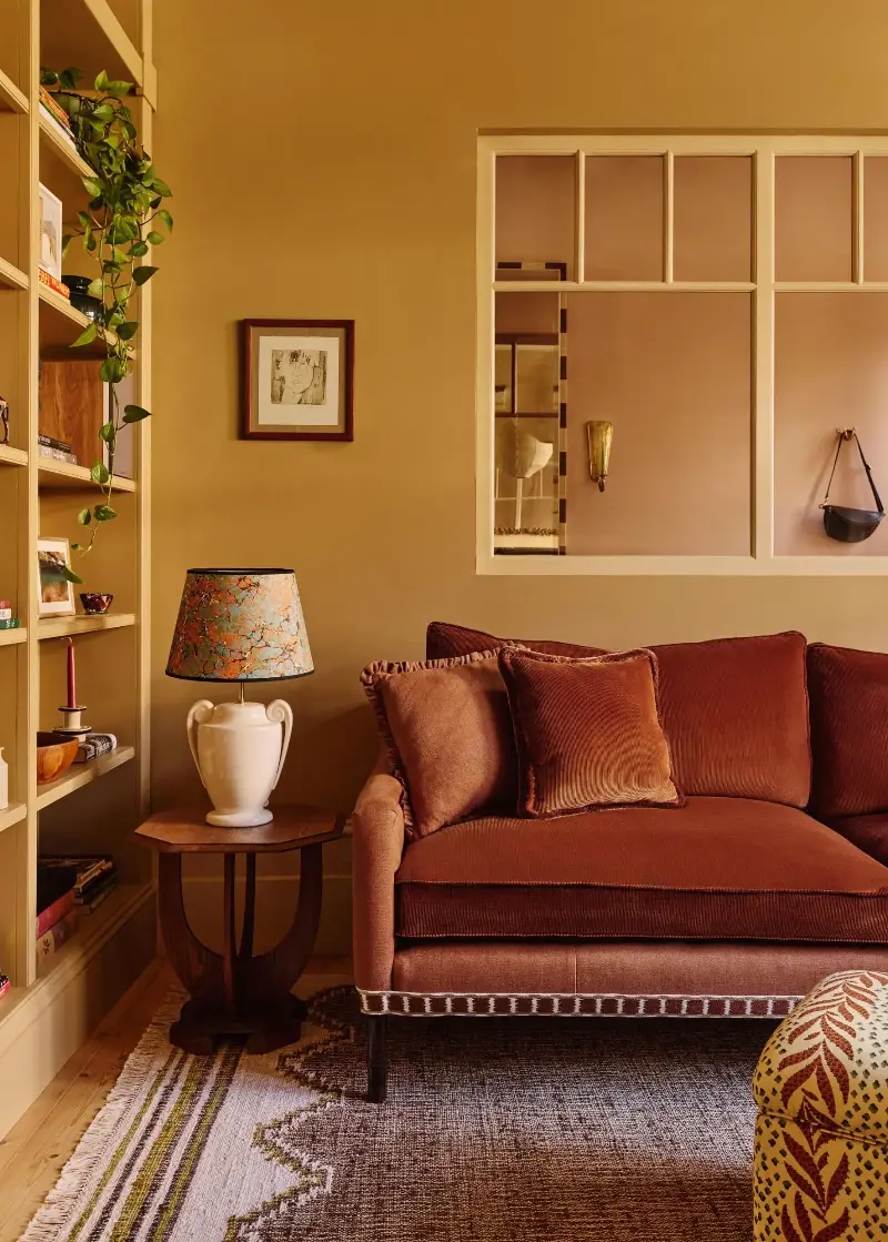
It's no surprise to see ochre cropping up in many homes right now. As the biggest interior trends shift toward spaces that feel warm, collected, and personal, there are very few colors that embody this sentiment as well as ochre.
"Ochre in the home makes me think of one word: soul," says Amy. "It’s full of glowing life yet soft, cocooning and heartening, tied to nature less obviously than the ever-ubiquitous green, but pulls us to plunge our hands into soil or find some sunlight to bask in."
"It resonates beautifully with interior design sentiment now because it ties into the shift towards earthy tones such as terracotta, reds, and caramel we’re seeing," she adds.
Not only that, but ochre can feel like a sophisticated, enduring take on yellow — a color that can be tricky to pull off without feeling jarring. "It’s much-needed yellow optimism (in a big progression from the buttery) in a steady, grown-up sort of way, and it’s familiar as a classic 70s shade, so there’s a bonus hit of nostalgia too," says Amy.
How Designers Are Using Ochre
Ochre can be a daunting color to add to your home, especially if you're more comfortable decorating with neutrals. That said, with a considered approach, ochre can feel effortlessly cool and balanced, whether you use it in kitchens, bedrooms, or living spaces.
1. Drench the Walls a Golden Ochre
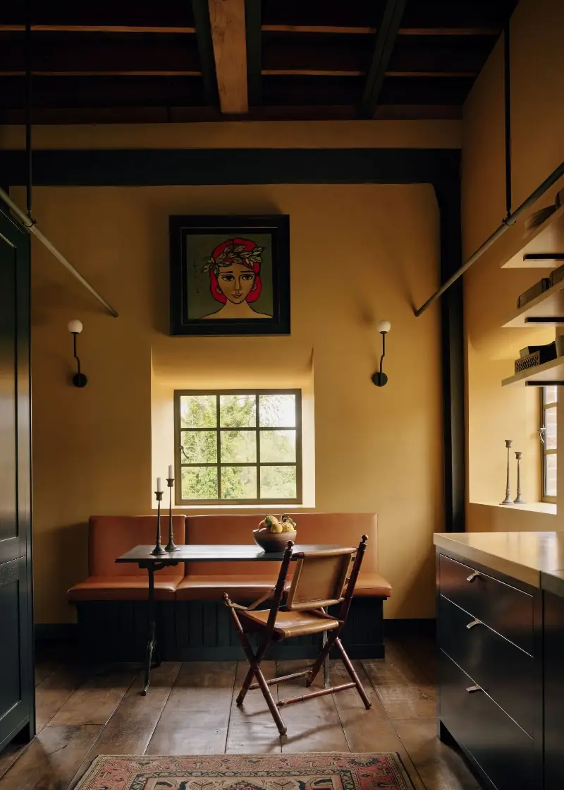
Often, the best approach to bold colors is to use them liberally. Above, Farrow & Ball's India Yellow, a deep yellow paint, brings depth and warmth to the walls. Alongside the dark wood tones and tall ceiling, it adds balance and coziness, without feeling overly colorful. "It felt like the right response to the industrial bones of the building," Sophie Goldhill, co-founder at Liddicoat & Goldhill and Hector Interiors, says of the paint color choice.
"Because it's not a bright yellow, it reads as sophisticated and collected rather than jolly," Sophie adds. "It creates something grounded and warm without overwhelming the space."
When using ochre on the walls, you don't always need to add many other colors. Here, the natural materials add enough contrast, resulting in a space that feels timeless rather than trend-led. "Combined with natural materials, timber, and the architectural details, it all feels like a piece," says Sophie.

Brûlée is a deeply warming yellow paint. In bright light, it will take on a livelier look, while appearing more earthy and subdued in lower light.
2. Pair Ochre With a Sunny Yellow
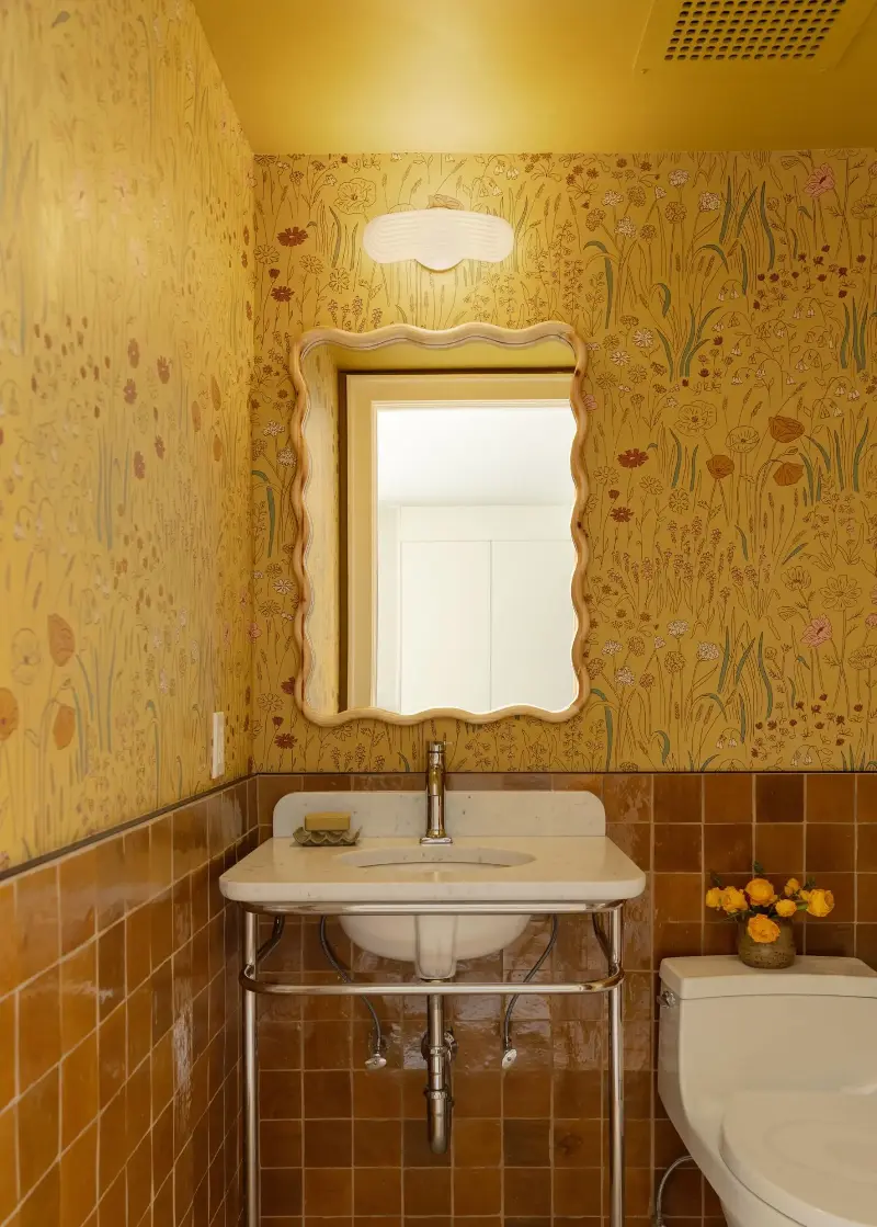
If you want to lean into a more colorful scheme, consider teaming ochre with a brighter yellow. In this powder room, the deep ochre wall tiles bring a sense of depth, while the yellow patterned wallpaper adds warmth and optimism. "We wanted the room to feel playful rather than dark or overly moody," says designer Rachel Robinson of Dunham Robinson.
"Keeping the deeper ochre on the lower half of the walls really grounds the space, while the wallpaper brings lightness, movement, and a little whimsy," she adds. "The two yellows share the same warmth, but the contrast in their intensity gives the room a lot of energy. It feels enveloping and cheerful at the same time."
3. Bring Warmth to Bathrooms With Ochre
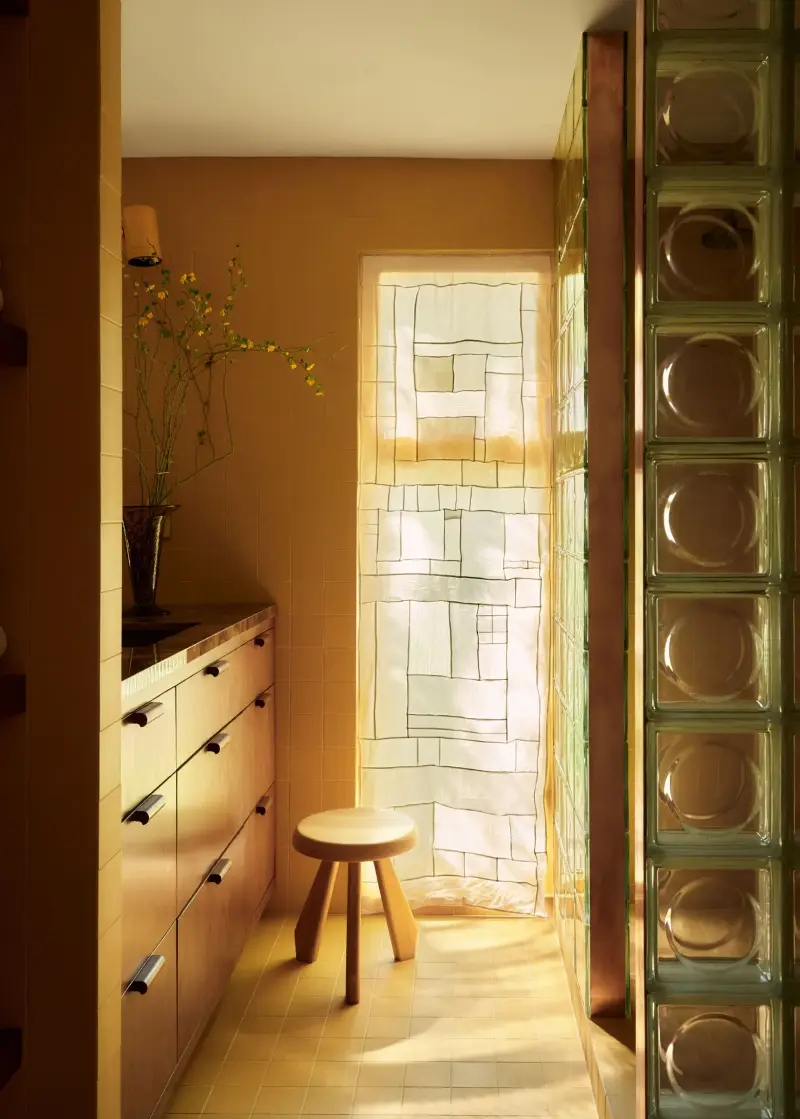
Bathroom color psychology tells us that yellow is one of the best colors for adding warmth to these utilitarian spaces. "We wanted the bathroom to feel warm and enveloping, almost as though it were glowing from within," say designers Joelle Kutner and Jesse Rudolph, co-founders of Ome Dezin. "The natural light changes the color throughout the day, which gives the tile a lot of depth and keeps the room from ever feeling static."
To complement the ochre tiles, the designers focused on layering different materials. "We paired it with warm wood cabinetry and shelving, while the glass-block shower brings in a cooler, translucent element that helps balance the earthiness of the palette," the designers explain. "We especially love the way the glass interacts with the natural light. It adds texture and a slight distortion while still allowing light to travel through the room."
"The materials are quite simple, but the variations in transparency, texture, and light give the room a lot of atmosphere," say Joelle and Jesse.
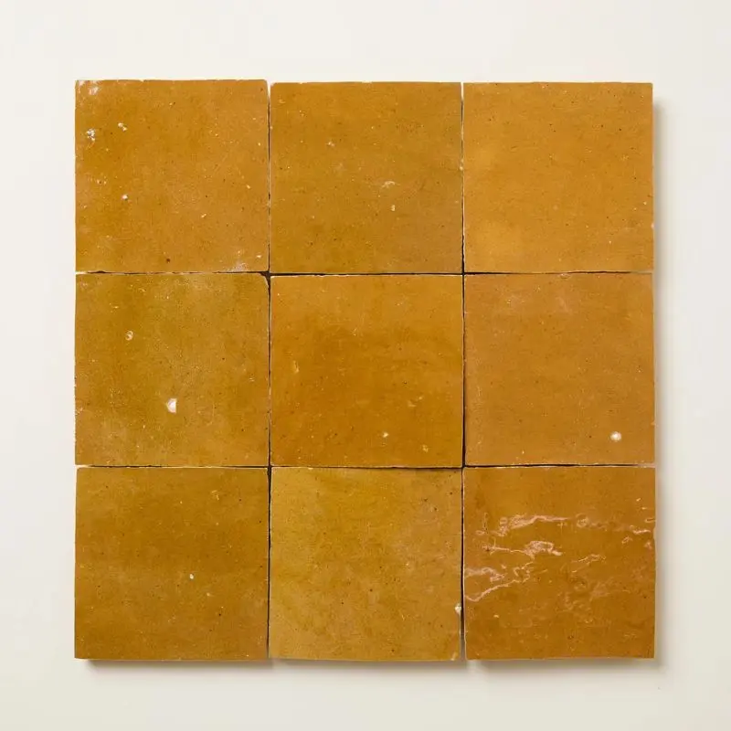
Adding ochre through tiles rather than paint is a great way to enhance the earthy look with texture.
4. Use Ochre as an Accent Color
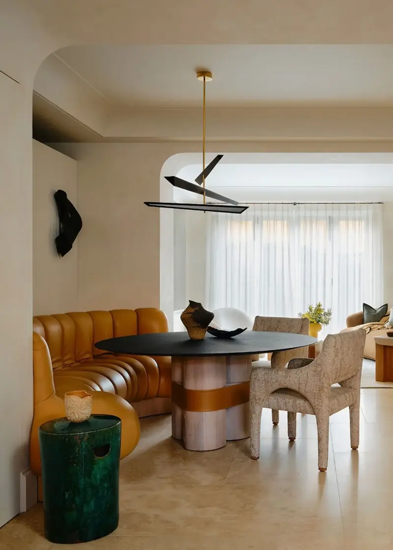
Decorating with ochre doesn't have to mean using it as the main color — it works just as well applied more sparingly. Think of it as an unexpected accent to pair with neutrals, as demonstrated in this open-plan dining space.
"We wanted to inject warmth into the space, and the ochre leather brought just the right amount of punch without disrupting the overall sense of calm," says Alicia Meireles, creative director at OWN LONDON.
"Because the dining room sits away from a window and lacks direct natural light, bringing in a sunny hue subtly brightens the entire corner," she adds. "The room’s palette layers tones of green, taupe, ivory, and sand, with metallic accents in the joinery and lighting. The ochre bench sits at the centre of it all to lift the space and inject some energy."
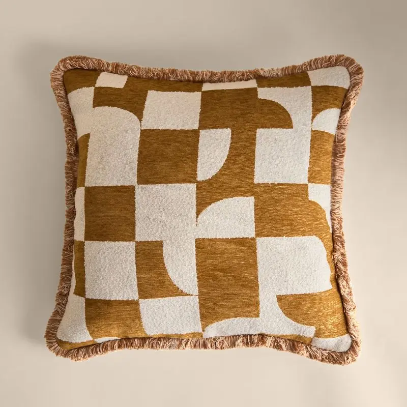
Even a much smaller addition of ochre, such as this cushion, can add warmth and depth to a neutral space.
5. Create an Immersive, Cozy Bedroom
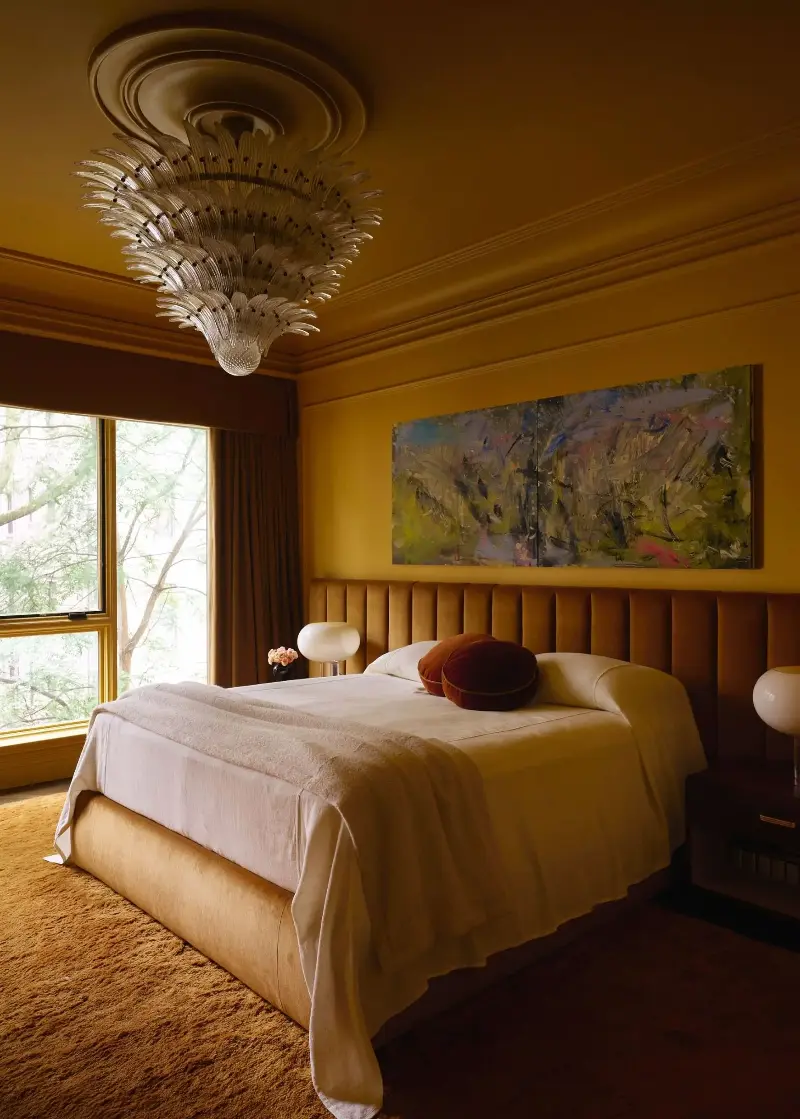
The basics of bedroom color psychology categorize yellow as a happy and uplifting shade, but certain hues can be too energizing in sleep spaces. Ochre, however, has enough depth to support rest and relaxation.
Above, interior designer, Crystal Sinclair, opted for Farrow & Ball's India Yellow on the walls, embracing color-drenching by extending it beyond the walls to the ceiling, too. "We wanted the bedroom to feel warm and cozy," says Crystal. "We color-drenched the room and added picture molding to the walls for a really luxurious look."
Creating a tonal scheme by pairing ochre walls with other warm tones like caramel — as seen on the headboard and drapery in this bedroom — can help the space to feel calm. Introducing too much contrast with complementary colors can be jarring in bedroom settings.
If you're won over by ochre, then you'll no doubt be drawn to similarly grounding shades, too. Gain more inspiration for decorating with earth tones for the year ahead, from the rooms they work best in to the best earthy color pairings.
And for more color and design inspiration, subscribe to the Livingetc newsletter.