“Are you spring or autumn?” was a staple of women’s magazine quizzes for much of the 1980s and 1990s thanks to Colour Me Beautiful, the colour consultancy firm which promised to help streamline the act of choosing your clothes and make-up based on whether your complexion was better suited to pastels or deep berry hues.
Far from obsolete, the practice has undergone a revival with the TikTok generation. And in our home-obsessed era, of course brands are now offering colour consultations for our interiors, too.
Etté, a creative agency for colour, offers two-hour masterclasses designed to boost your confidence in choosing different shades and help you find your home’s palette.
Its recent £85 workshop is well timed. I’m only four nights into a new rented flat and the walls need more than just a touch-up.
Sitting at a table in Islington scattered with swatches, glass of fizz in hand, I’m listening avidly to my guides for the evening, Despina Curtis and Natalie Jones.
The pair boast an impressive portfolio of work with design greats, from Tom Dixon to Carl Hansen & Søn. Curtis is a seasoned London-based style director, while Jones is the creative behind Caro, a design brand, stylish B&B and studio space in Bruton, Somerset. They founded Etté in 2023.
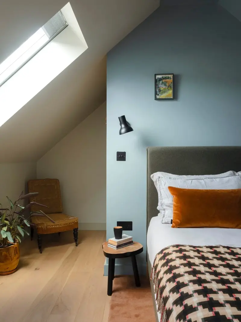
What I quickly learn is that finding my palette — and veering away from those trusty neutrals — is less about working out whether you’re a spring or summer and far more about orientation. A cool blue can work well in south-facing rooms, for example, to balance out the yellow undertones from all that daylight. Unsurprisingly, north-facing rooms tend in the opposite direction, meaning warm yellow or pink tones are best.
Even with those guidelines in mind, for some of Etté’s clients it can be difficult to know where to begin. “We often start by talking about particular memories associated with colour,” Curtis explains. “We ask where you’ve visited and what you might remember.”
Nearly everyone has a collection of furniture, art or objects, which the duo suggest as another obvious place to start.
Choosing wall colours in line with your furniture requires paying close attention. Consider the tone of any wood — is it warm, such as oak or walnut, or cool, such as an ash or charcoal? And when selecting an appropriate backdrop, decide whether the furniture is going to be a feature — should it blend in, or stand out? What the pair have learned, since founding the agency in 2023, is that every client — no matter how hesitant — always enjoys the process.
“It’s so personal,” Jones adds. “But we find people are often surprised to learn they actually do know who they are — and what they like.” Jones spent her early career in trend forecasting and and has brought those skills to Etté. Asked for her predictions about the year ahead, she says: “We’ve been seeing these chocolate browns and rich, earthy colours come out on top, and I think we’re only going to see more of them.”
Curtis is more interested in emerging materials and textural trends. “Mixing materials is a bit like layering your wardrobe,” she explains. “And we’re increasingly looking at daring combinations —say, for example, a texture split on a wall.”
Cornwall-based Clayworks, which offers locally sourced natural plasters and lime finishes, is a must-try for the more adventurous. “Features of wood, earth, or stone can be really grounding,” Curtis adds.
And as to where you should be looking for inspiration, both are clear — stop the scroll and instead get out and about, whether it’s a walk in the countryside or a day at the beach.
The experts are fresh from their own field trips, to the newly renovated Chancery Rosewood in Mayfair and the latest collection at Margaret Howell.
“You can find an interesting palette anywhere — from a building to a fashion brand, painting, or film,” says Jones. “Colour is all around you.” But perhaps the best advice I gleaned? “Just go for it,” says Curtis. “You can always paint it back.”
With their combination of advice, anecdotes and a little liquid courage, by the end of the evening Curtis and Jones have me convinced — I’m going for it.
Soon my stark new walls will have been softened with deep, earthy reds and a touch of Farrow & Ball blue. At least until the week before my tenancy is up.
Five more lessons in living with colour
Ask yourself: How do I want to feel in this space?
Are you looking to brighten a bedroom, where you want to feel warmed and enveloped? Lean into ‘colour-capping,’ and paint a darker tone on the ceiling. Or perhaps you’re sat in a study, where a vibrant wall or pop of colour might leave you energised at work – so, be bold.
Use colour to activate a room
Even a box room without notable architectural features can be enhanced by thoughtful use of colour and texture. Stick with similar tones or push yourself with opposite ends of the colour wheel. “Hallways are a great place for block colour – a talking point when you first enter the home,” Curtis explains.
Get over your fear of the dark
Darker colours don’t necessarily make a space look smaller. Instead, it’s more about where you choose to paint in a space – a ceiling, statement wall, or cosy alcove – that dictates how a dark tone is perceived.
Neutral doesn’t mean boring
Look closely at the undertones when trying out a neutral. Then layer with texture and material, and use darker furnishings and features to ground the palette.
Test, test, and test again
Test in all kinds of light and at all times of day. Paint a sheet of paper – not directly on the walls – and position colour charts or materials in the orientation they’ll be facing within your space. And take your time with it; Curtis admits choosing the right shade for her living room took six weeks.
© The Standard Ltd